Role
Senior Product Designer
Company
Ieso Health
Keywords
Quantitative Data, User Journey, Engagement
Sector
Healthcare, Mental Health, B2C
50% increase in user engagement by redesigning the onboarding flow
Ieso is a B2C startup that provides mental health online typed therapy. In September 2023, I was responsible for launching an MVP app for both iOS and Android in the UK and US markets, focusing on GAD patients - people with generalised anxiety disorder.
After launch, the app received negative App Store reviews, mainly due to login issues. Additionally, data showed that users were dropping out early in their journey.
Here, you will learn about my design iteration process, involving stakeholder workshops, cross-collaboration in squads, user testing, and design implementation.
The Problem:
Data & Observations
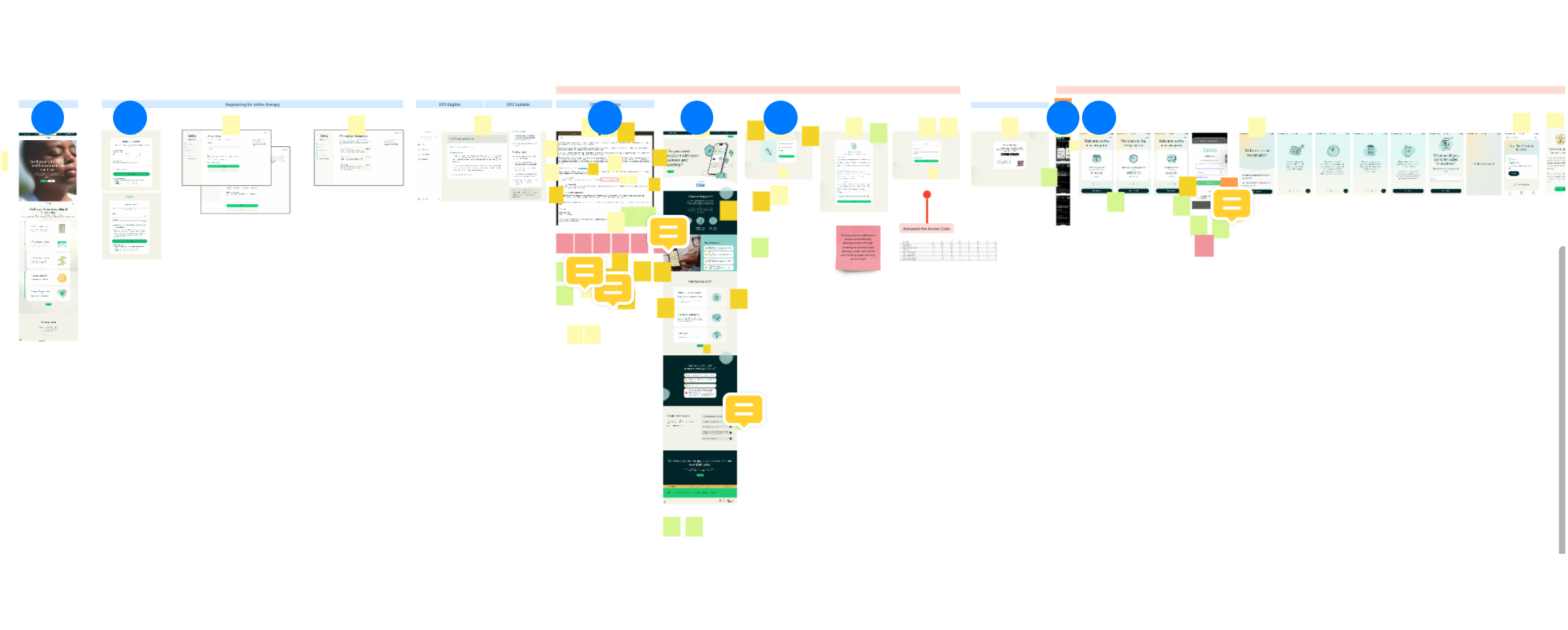
Find the quantitative data at the time, relating to registration, login and onboarding.
Assumption: Users were dropping out because of technical login issues. Hypothesis: If we fix the login issues, retention will increase by at least 20%.
39.3%
Users that activated the access code
27.6%
Users that onboarded
2.7*
Stars rating on App Store
Root Cause Analysis:
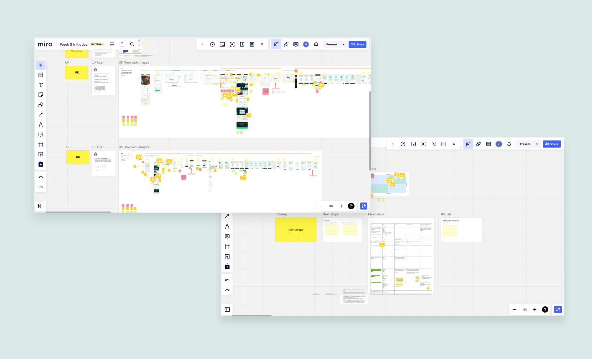
Stakeholder Workshop & Findings
I have designed a workshop involving 10 key stakeholders to gather data, investigating the root of the problem and the impact on users and business(see image above). Stakeholders from both UK and US teams collaborated together representing everyone's voice and concerns. My role: As facilitator, I was responsible to navigate difficult conversations, specially when aligning goals. As a Senior Product Designer, I contributed with the design and user research perspective, advocating for the user.
Findings:
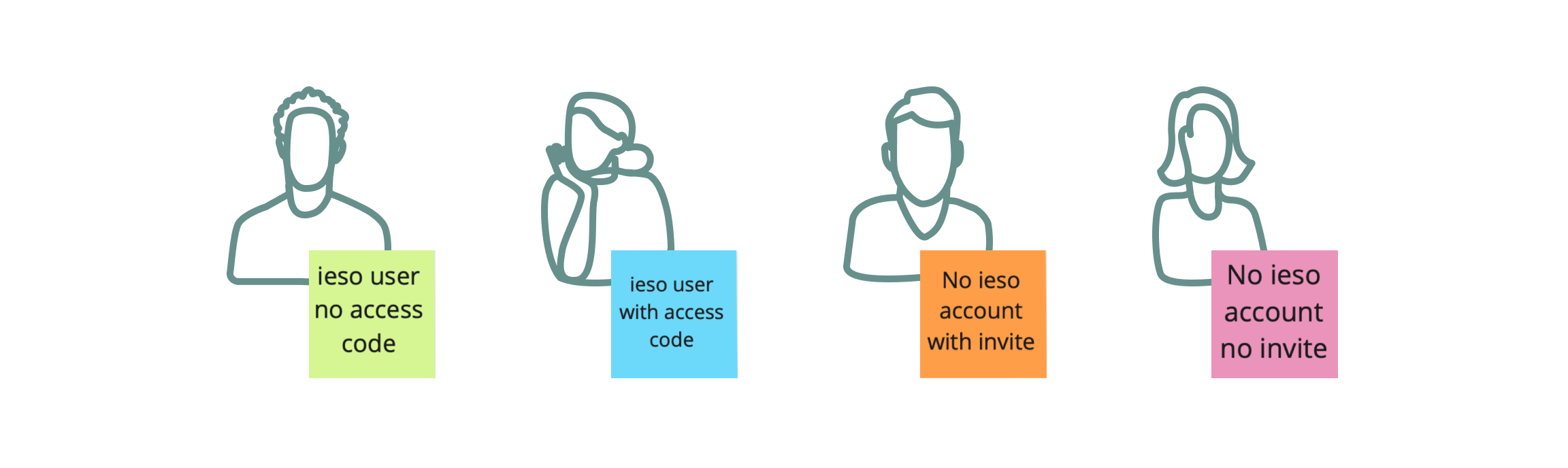
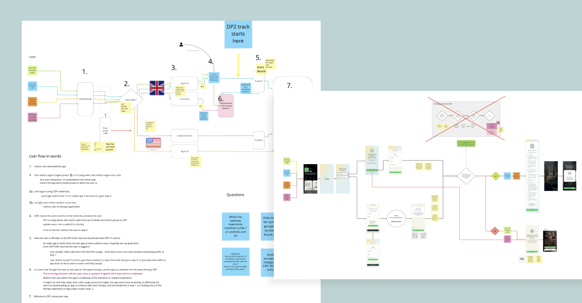
To save a considerative amount of time in the MVP development to deliver within the deadline, it used an existing login from another ieso platform, compromising the overall registration and onboarding experience.
The messaging wasn't clear:
- Messaging wasn't considering the two Ieso distinctive apps.
- People confused the two apps: The online typed therapy (web app), and the GAD programme (mobile app).
- Patients didn't know they needed an invitation to access the app.
The user journey was broken:
- Patients faced multiple friction points in the registration process.
- Many couldn't locate their access code invitation.
- Some patients reached a dead end due to incorrect account use.
Assumption:
Informing the users up front that it’s invitation only will remove confusion.
Hypothesis:
Simplifying the onboarding and registration process by reducing touch points will increase registration completion by 30%.
The Solution & Execution:
Define goals and implementation
We aligned our vision and defined our goal: How might we increase retention by 35%?. We split into three main squads: Marketing comms, Onboarding and Registration - implementing consistency and improving the holistic patient experience.
My role in the different squads:
- Marketing Comms: Improve messaging clarity across touchpoints.
- Onboarding: Build user trust and motivation.
- Registration: Simplify the account setup process.
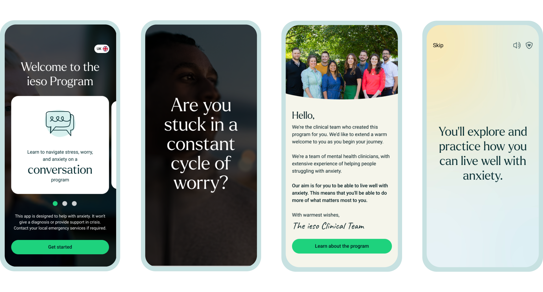
Phase 1: Re-design Onboarding Experience
Assumption: Addressing users' emotional weight of seeking mental health support will build trust and confidence in every step of their journey.
Hypothesis: If users see a clinician's video during onboarding, they will feel more supported, leading to increased engagement and reduced anxiety.
- Product Designer (Myself)
- Product Owner x1
- Clinicians x 2
- Engagement Clinician x1
- User Research x1
- iOS Front-End Developer x1
Our responsibility was to review the in-app onboarding experience to build trust with patients, and motivate them to continue with the GAD programme.
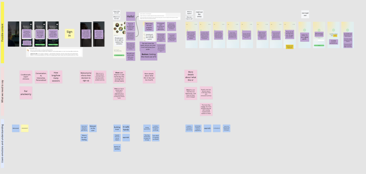
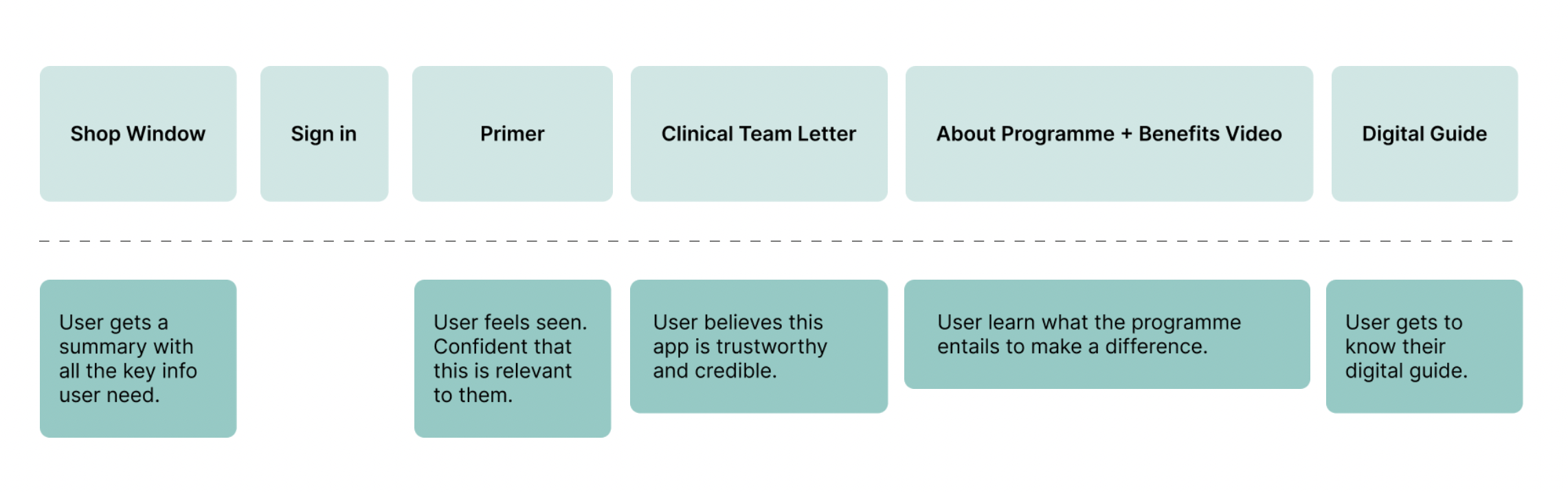
In collaboration with clinicians, I re-wrote the content design integrating the clinical tone and balancing with a supportive and empathetic messaging, into a seamless experience with purpose to patients. How to design with empathy?Considering these in the design process (see image above):
- What information patients need;
- What understanding we want them to take;
- What patients might be feeling;
- What emotions we would like them to sense.
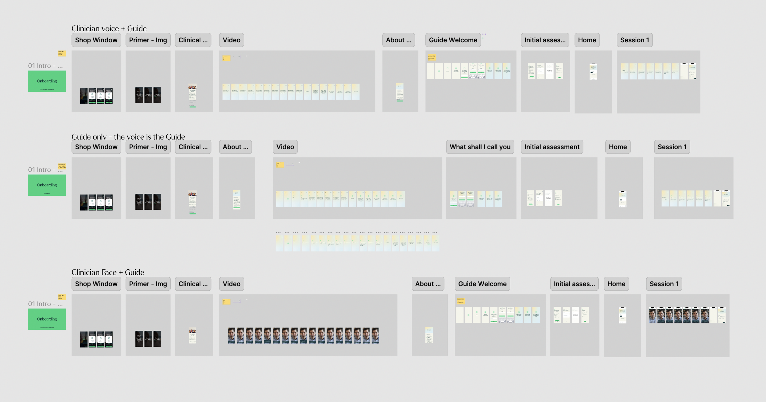
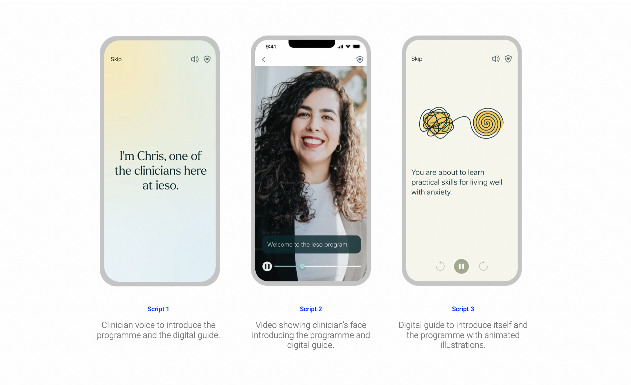
Here (image above), some of the explorations and the prototypes I've created to test three hypotheses on how to introduce the digital guide (AI Coach) to the patient.
Findings:
- A clinical presence reinforces trust and credibility to the app.
- A clinician video sets expectations for ongoing involvement and communication with clinicians.
- An identity to the artificial intelligence coach creates confusion “Who am I talking to?”
Phase 2: Re-design Registration Experience
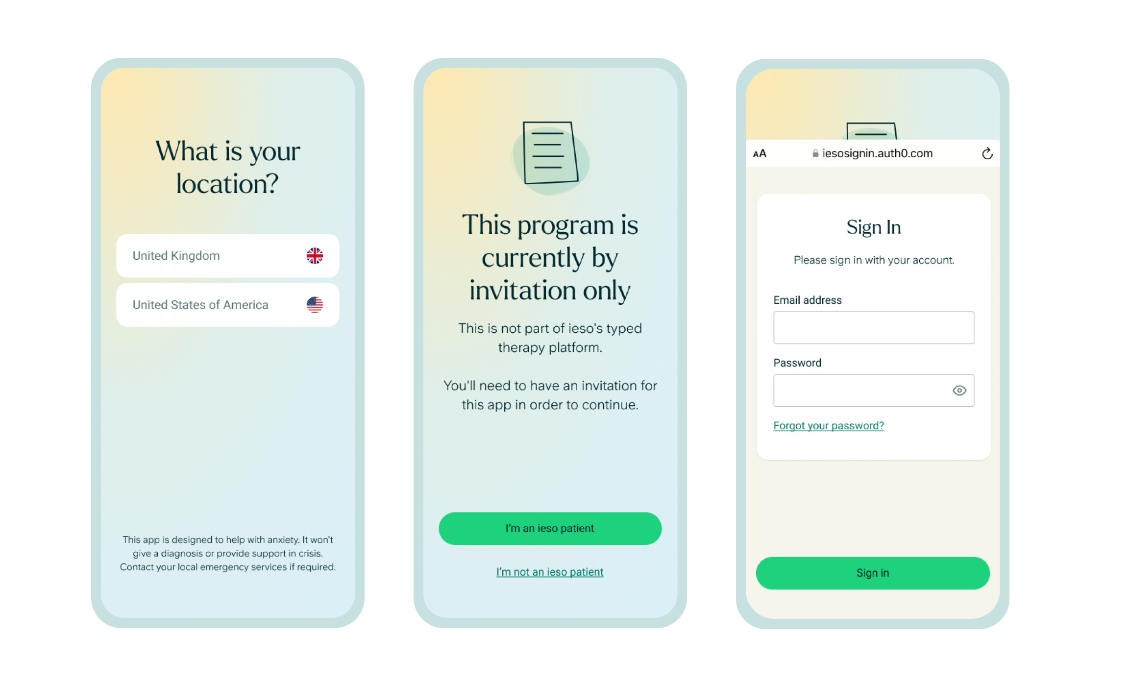
Assumption: As a medical device, informing the users up front that it’s invitation only will remove confusion.
Hypothesis: If users don’t have to worry about the access code, they will have a more smooth experience, and so, will increase registration completion by 30%.
- Product Designer (Myself)
- Product Owner x1
- Engagement Clinician x1
- Developers x3
Our responsibility was to simplify the registration to improve retention.

My role was to advocate for the user and deliver two solutions - short and long term. Collaborating with the developers, I’ve designed multiple user flows to address gaps and potential solutions.
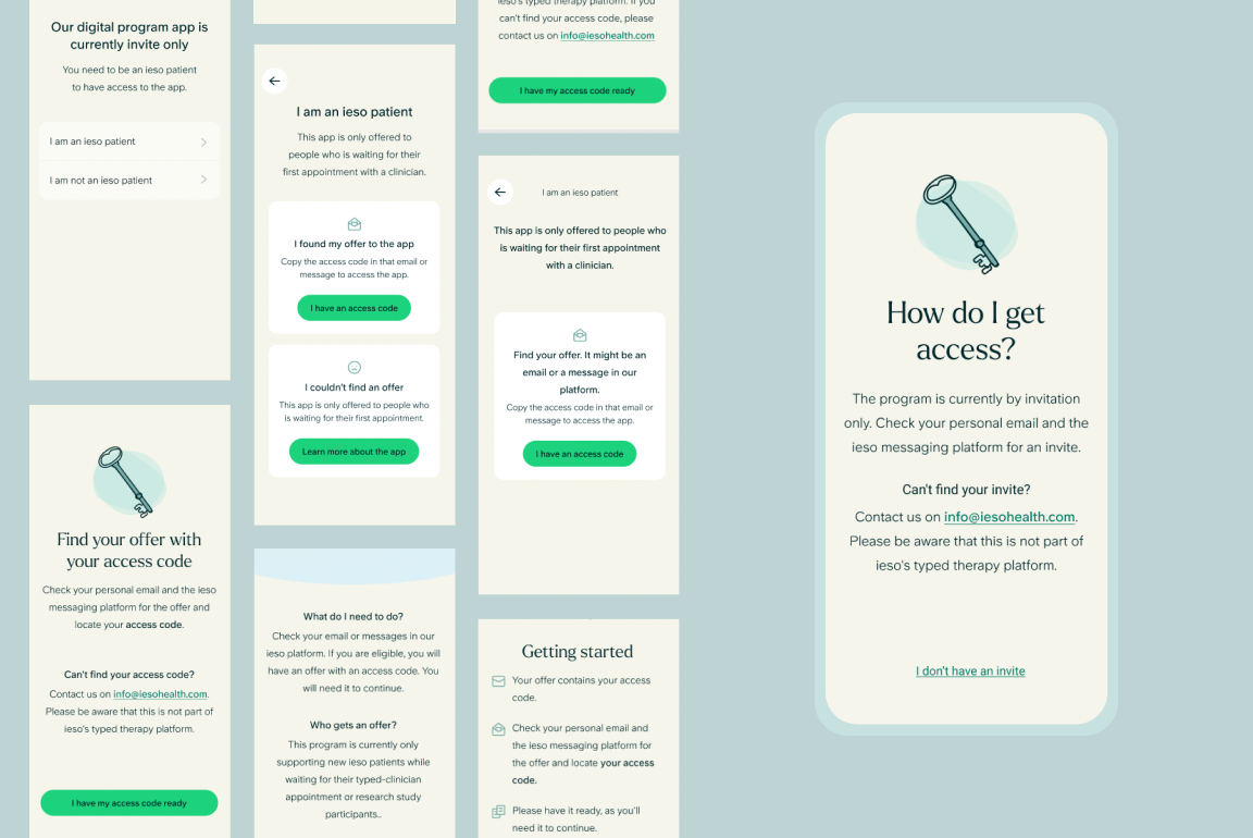
Short term solution:
- Simplify and clarify messaging;
- Design additional screens so users don’t reach a dead end in their journey.
Long term solution:
- Remove access code from user journey, add it in backlog;
- Simplify journey by removing unnecessary touch points;
- Addressing the confusion between the two ieso apps directly in the messaging.
Implementation Results
Before the redesign, only 27.6% of users completed onboarding. After implementation, this improved to 46.2%, a 67% relative increase. Additionally, engagement rose by 50% weekly, with user sentiment improving in app reviews.