Role
Senior Product Designer
Company
Ieso Health
Keywords
Logo, Identity, Branding, Website, UX, UI
Sector
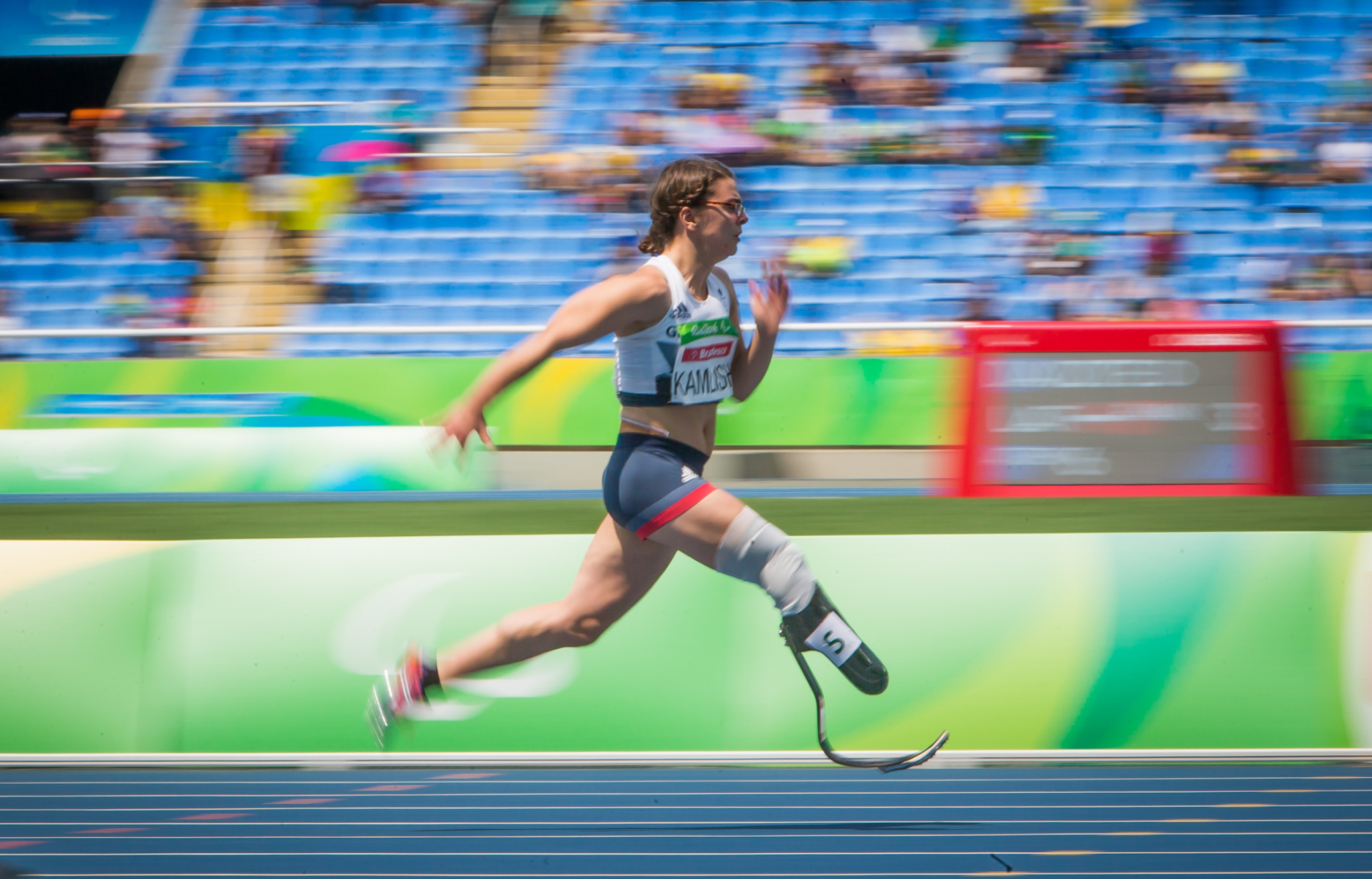
Sports
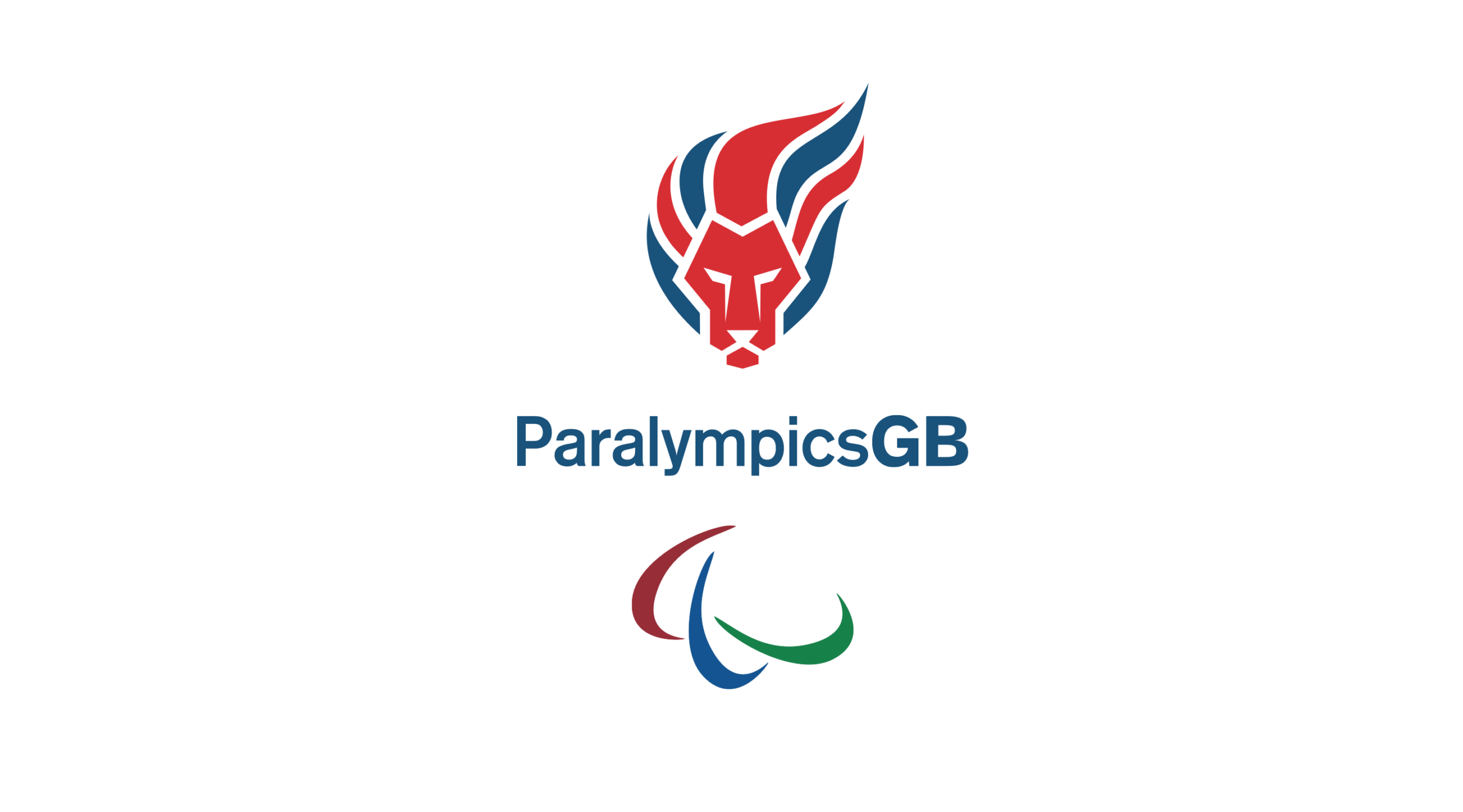
A brand refresh and a website following the accessibility guidelines
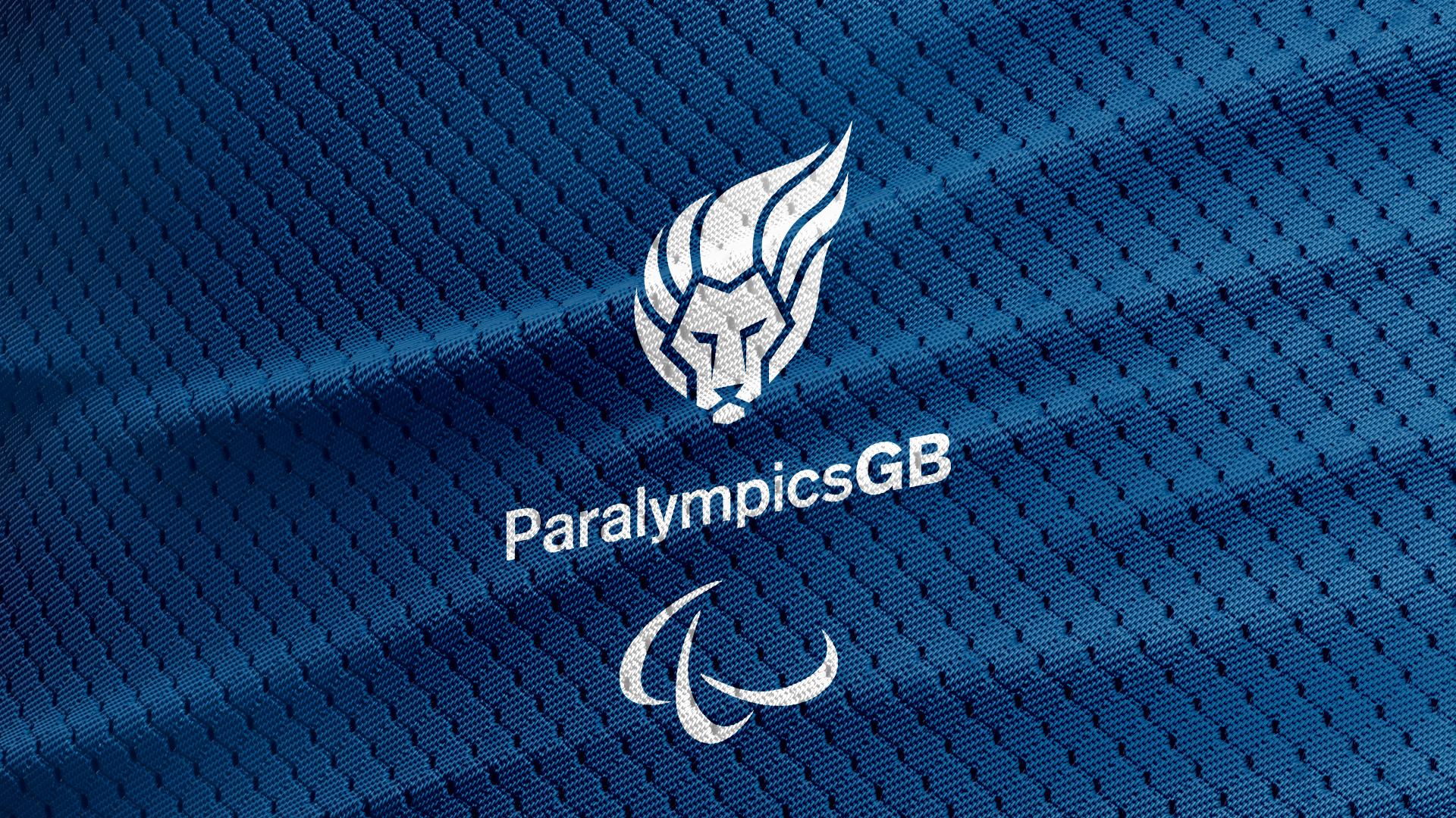
The ambition was to adapt the logo to a digital environment. Make it accessible and readable across all sizes and platforms.
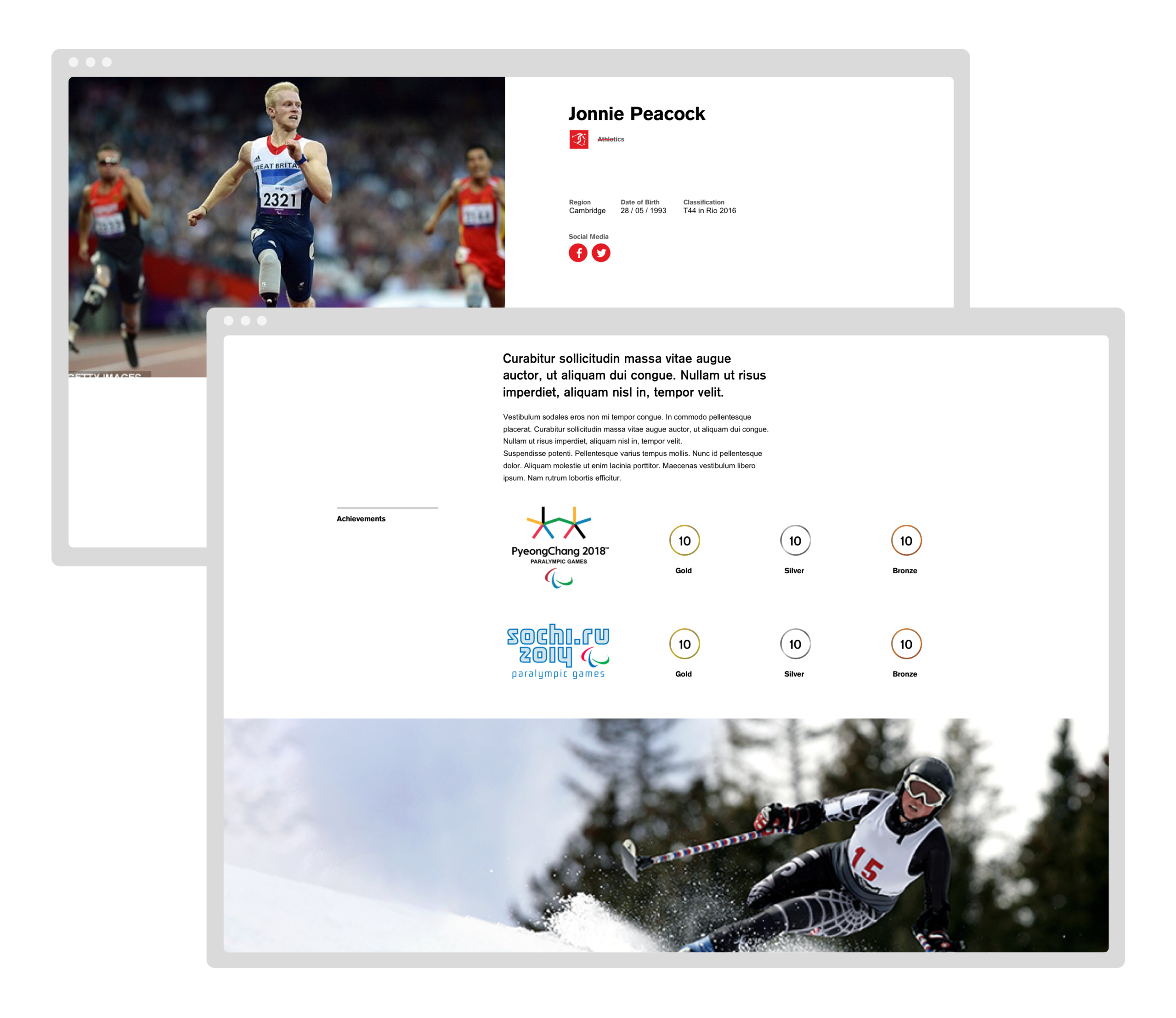
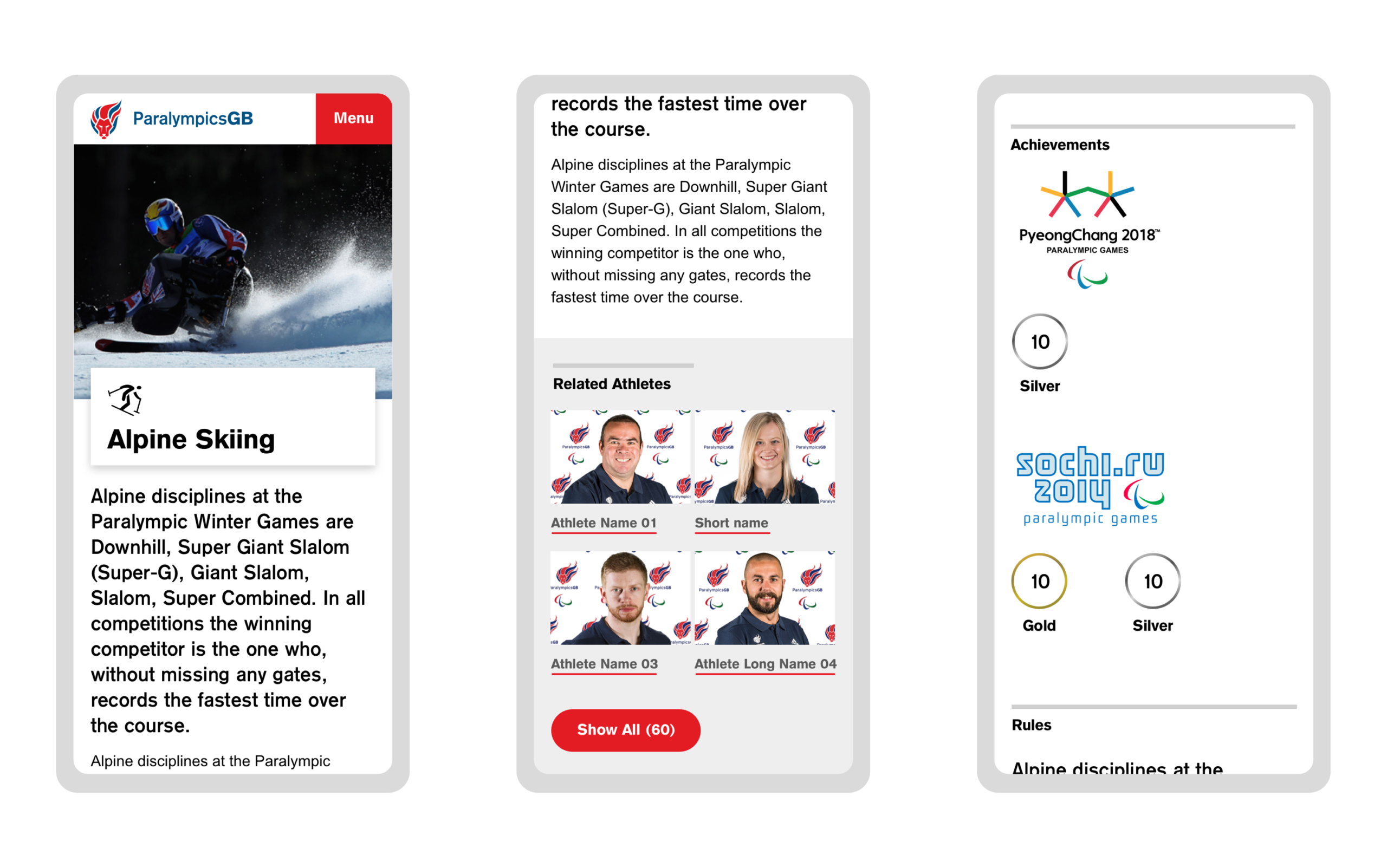
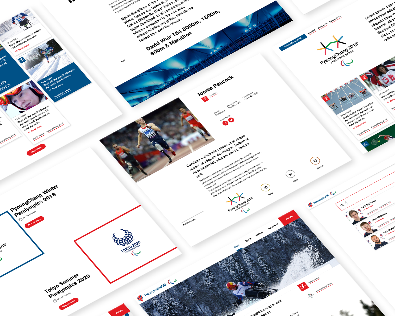
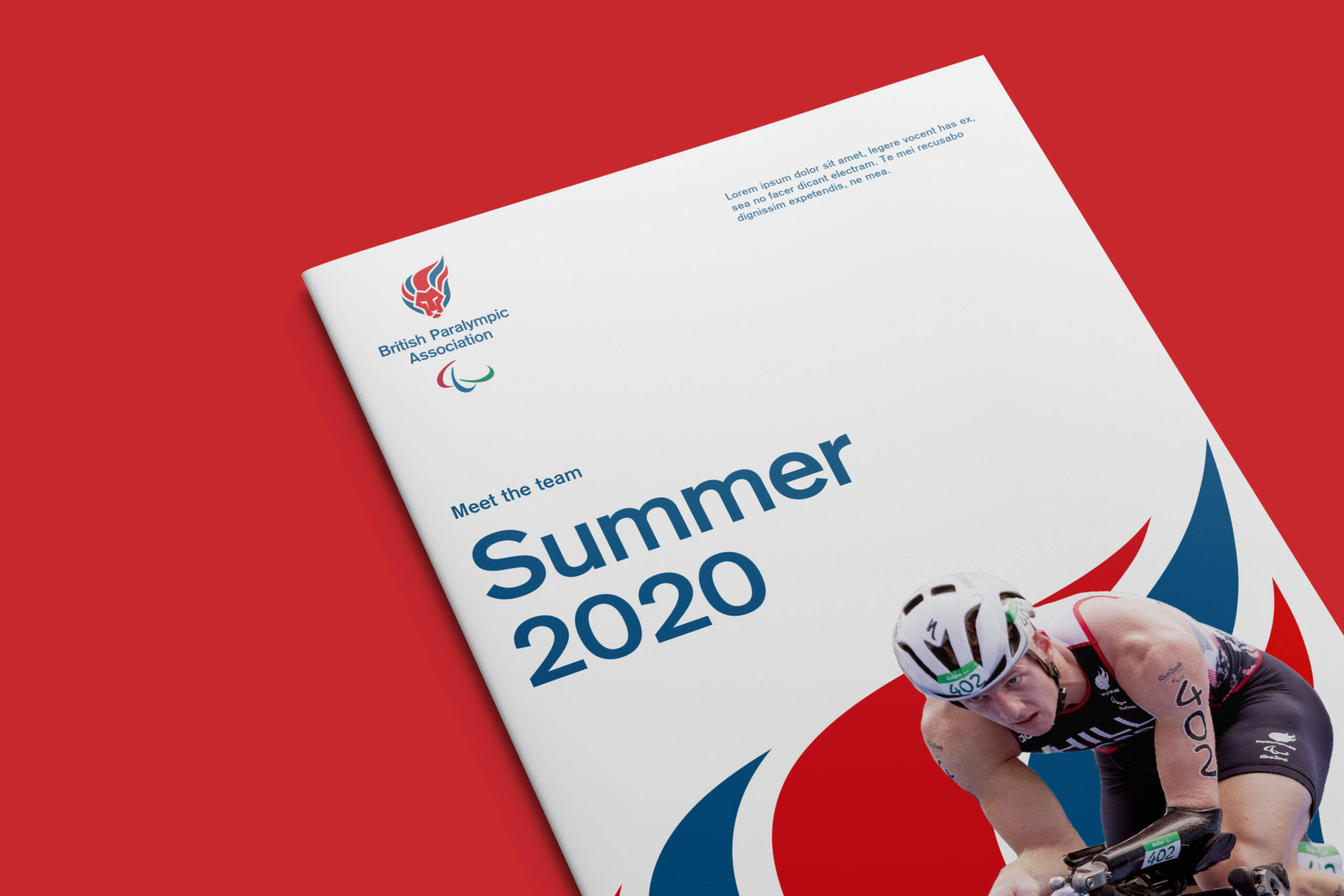
A new website fully accessible - Acessibility AAA - was equally needed. Our main goal was to engage fans. The idea was to get away from disability conversation and celebrate the sport itself.
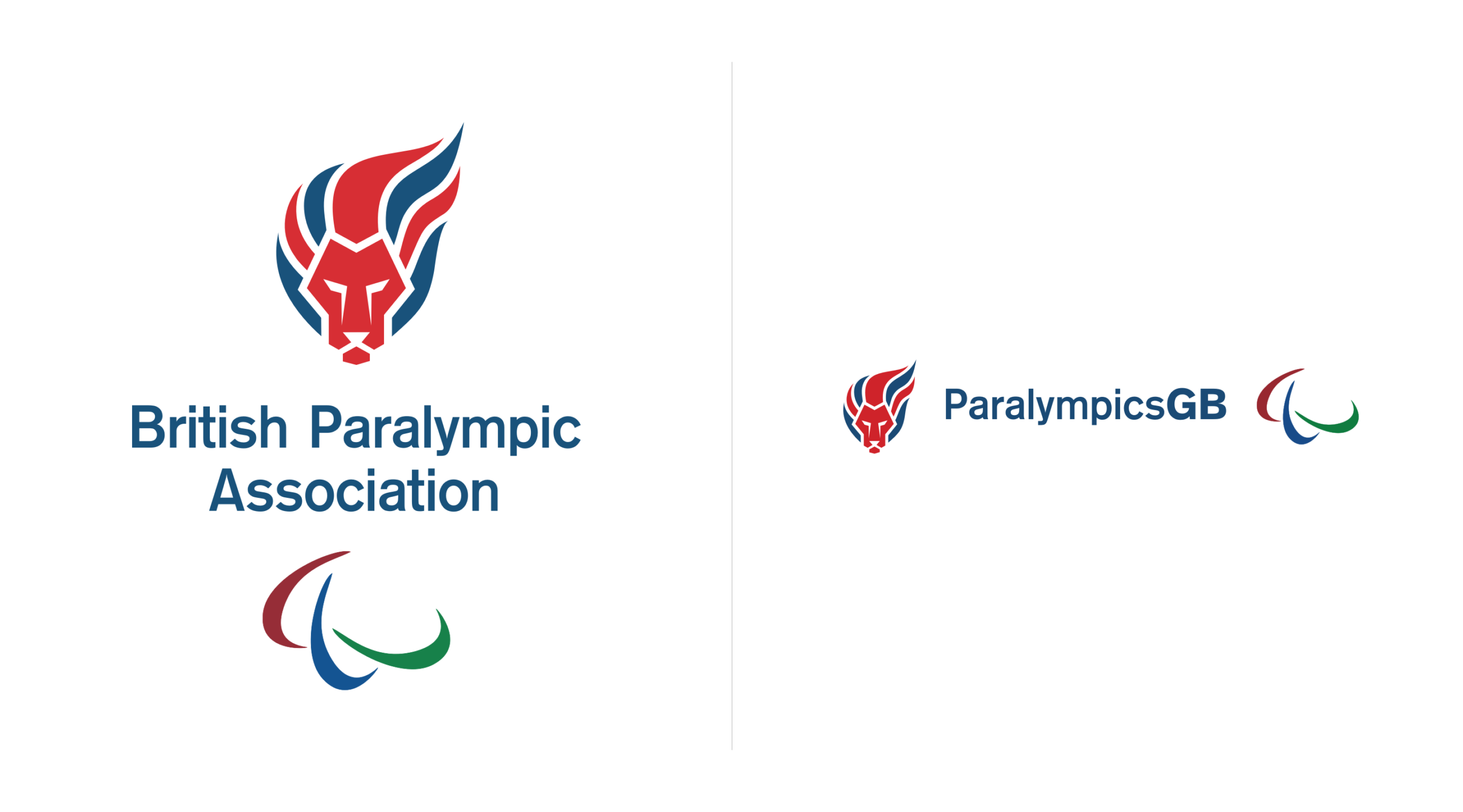
In order to understand how the original mark faces complications in multiples channels, our first exercise was to analyse it. The space between the elements was so tight that made it very difficult to be legible, specially in small sizes. The long and curvy hair created the ilusion of the mark being off centre. And the multiple flames formed by hair makes the mark shape less bold and strong.
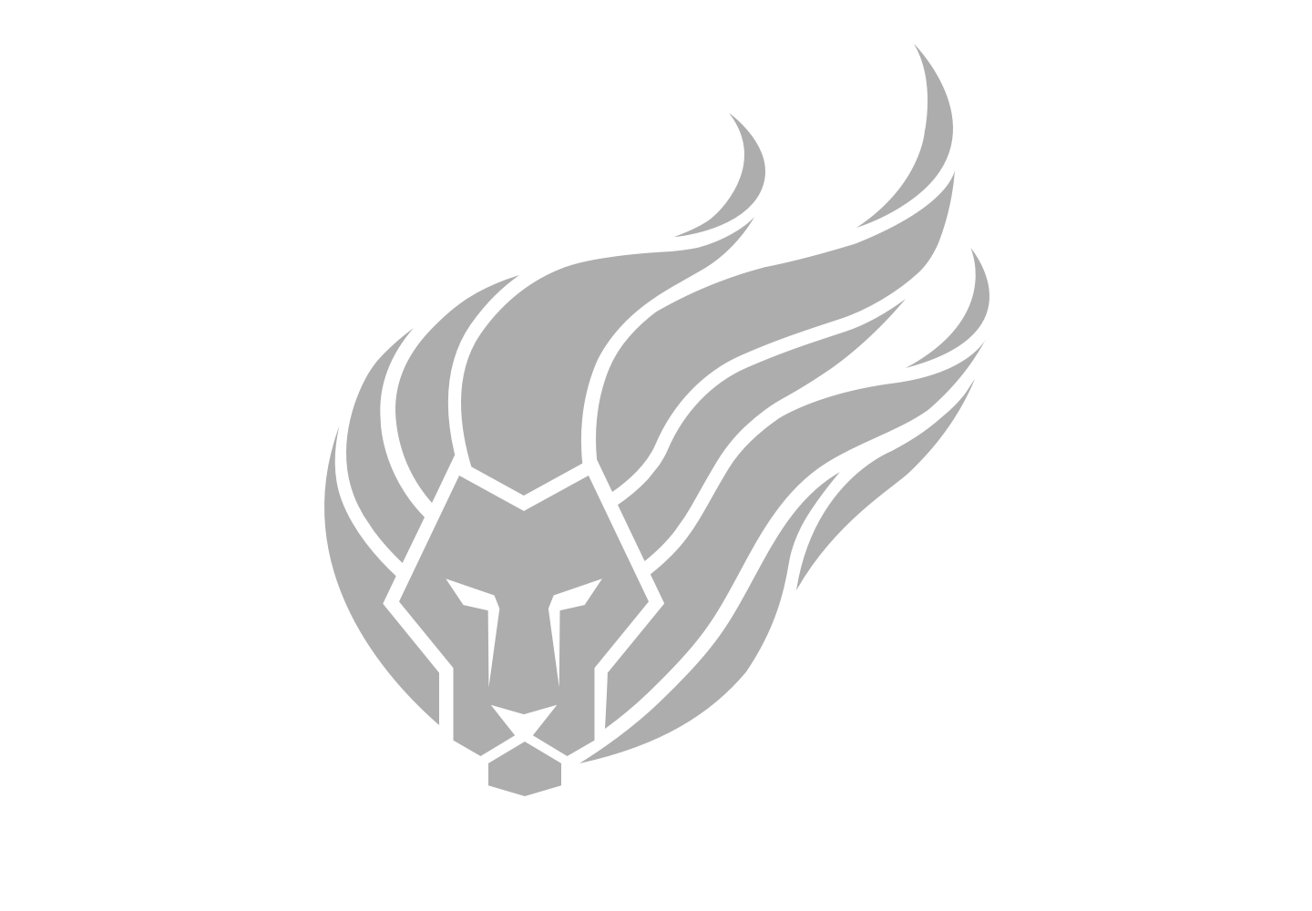
Original logo mark in grey

Details from original logo mark
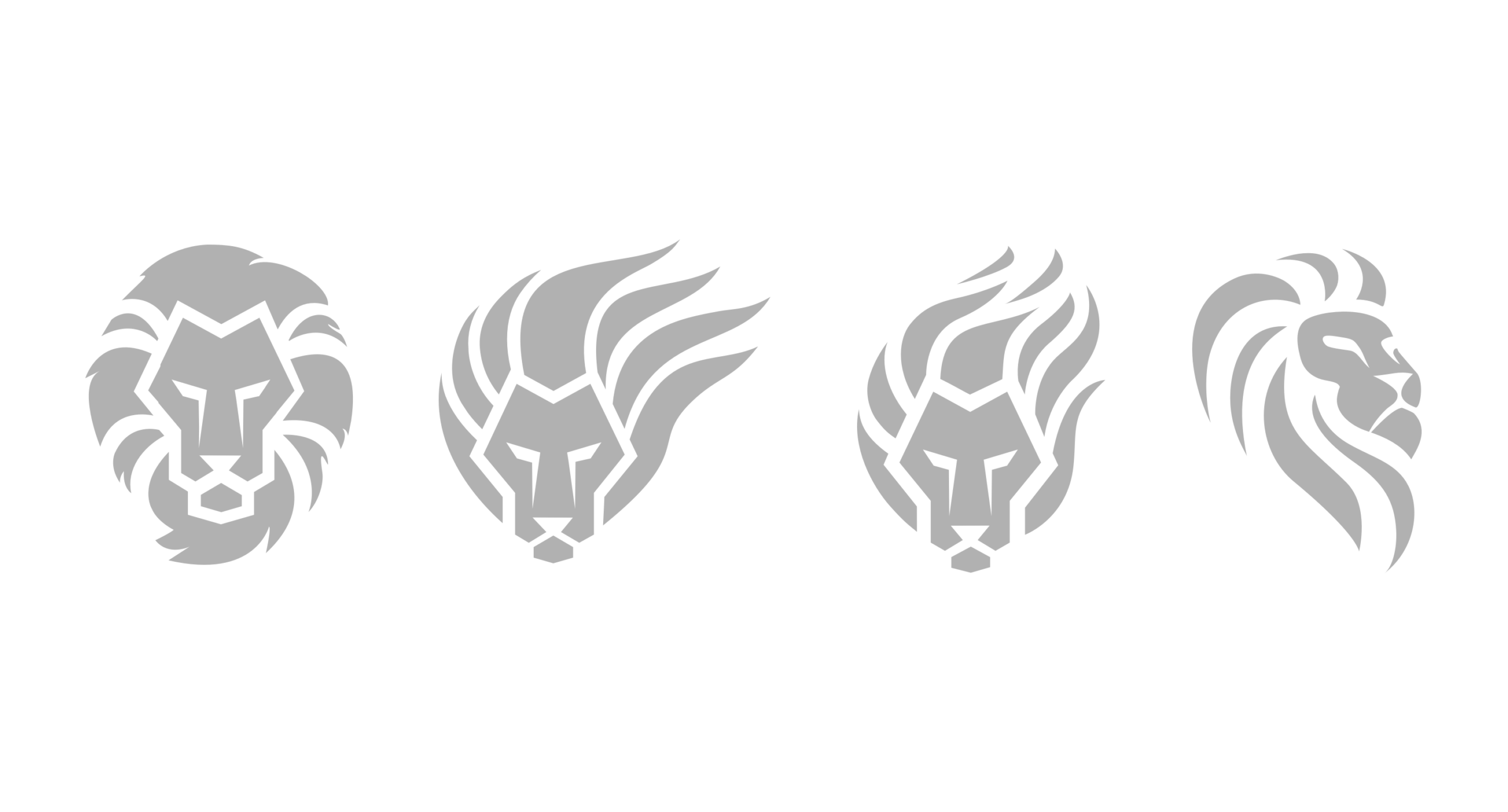
Initial sketches for lion mark
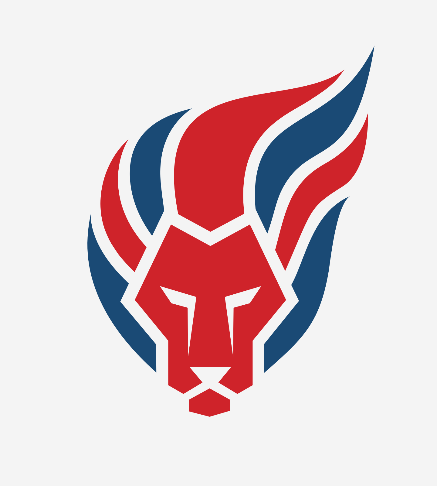
New lion mark
Based on our analysis, we wanted the mark to be even closer to the original lion mark. We believe that we were able to keep a recognized ParalympicsGB mark by keeping one flamy form of the hair. Small details were removed to simplify the shape and make it bolder. At last but not less important, we crafted the space between the elements to keep it consistant and larger.

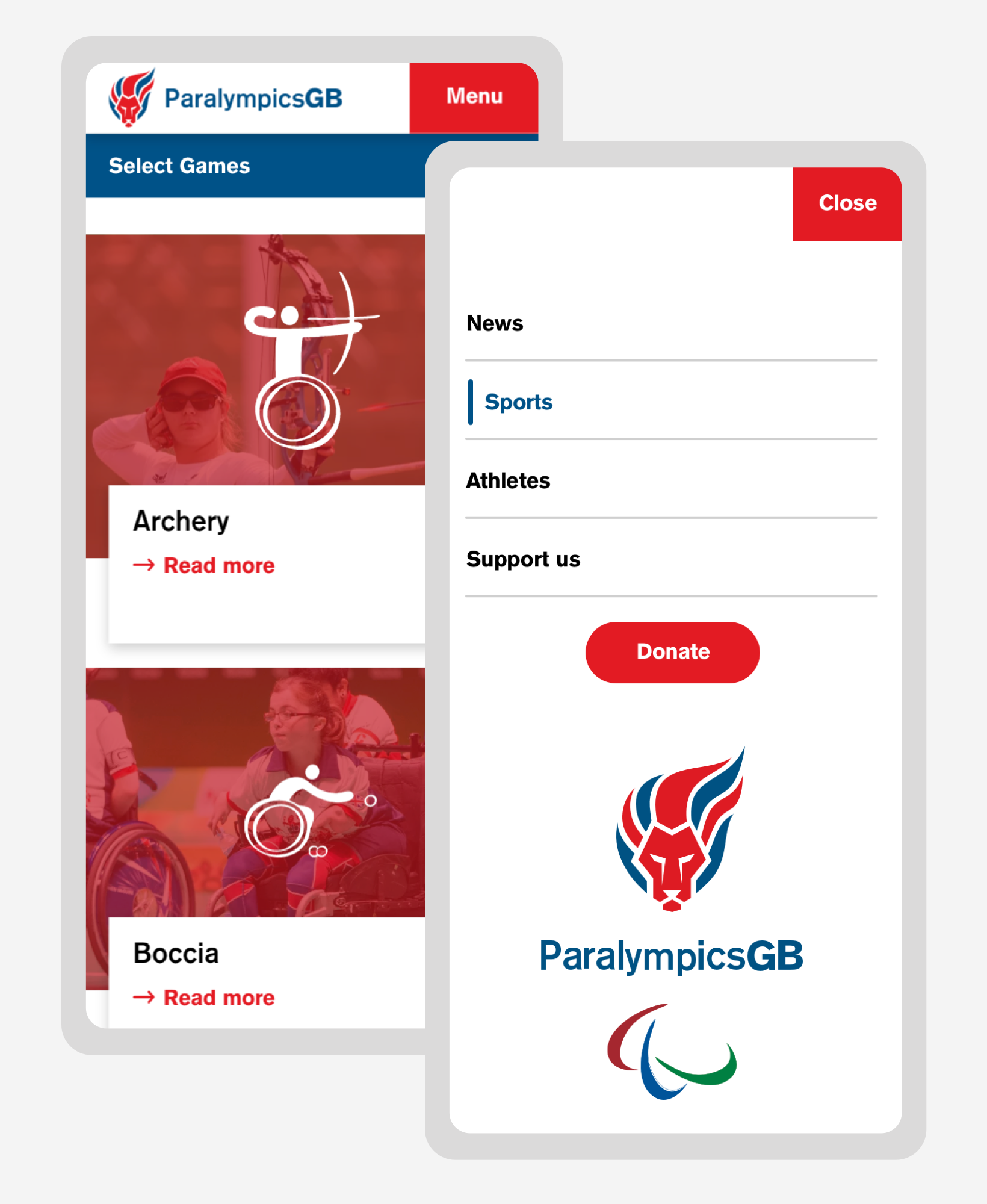
For the website, the brief was very clear and straight foward. How to engage more fans? Bring the team life forward - news, sports, games, athletes. Celebrate ParalympicsGB. How to make a triple A accessible website? The challenge was not just about typography, colours, but also how to build an interesting layout with these new limitations.
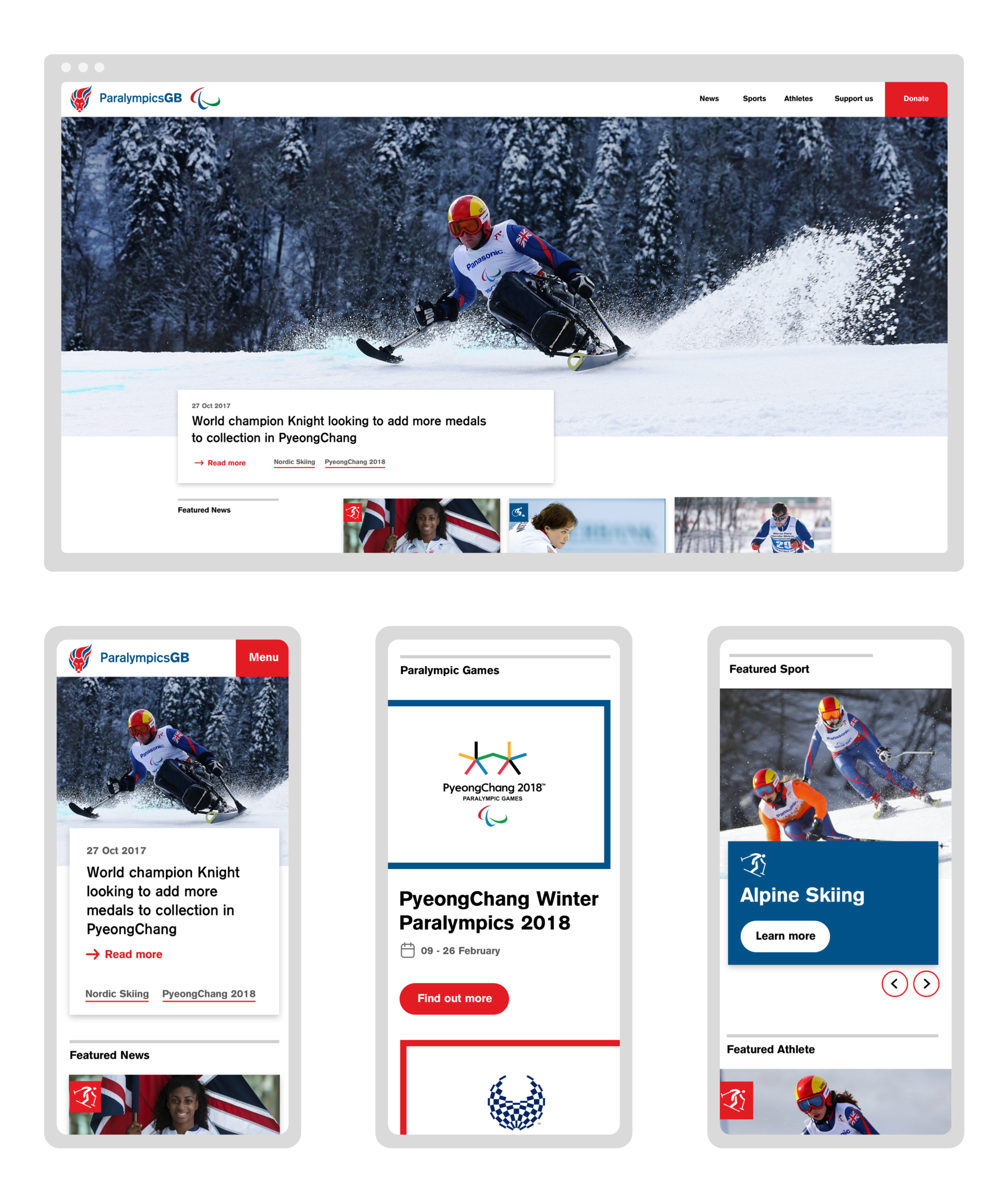
Navigation on mobile
Nowadays, a burger menu on mobile is considered by a few specialists as a standard behaviour. For ParalympicsGB users, we had to find an even better alternative to be accessible to everybody.